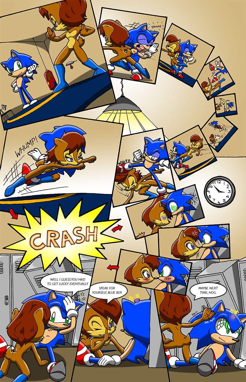
Guy named Mitchell Koller sent in this interesting piece. Also asked for me to include a bit of his own words:
“I always liked the way Sonic and Sally’s relationship was handled in the show. Very back and forth, on and off, lots of back-handed compliments and rivalry-like flirting. Made for a very un-cliche and interesting relationship. I thought I’d illustrate that as well as push myself with my panel layout. It’s nothing compared to Glitcher’s work, but I thought I’d throw my hat in the ring.”
Anyways chapter 3 will be starting tomorrow. Maybe Saturday. So we will either see another Guest strip tomorrow or the start of chapter 3.
Paul


I like. Fantastic job!
Now that was just adorable. A very interesting panel layout too.
Cute, I’ve seen this guy on dA.
http://jeremyacorn.deviantart.com/
Wow, now this is more like it! After the last couple of pages, I wasn’t expecting something this accomplished from newcomer Mitchell Koller. The composition is just brilliant and well suited for the nature of the story. There are some terrific angles in the panels and the characters appear very lively and fluid duking it out. Even the stick figures in the smaller panels look great compared to Vlad Yvhv’s comic. I love this. It’s at least as good as Salamander’s art and I’m feeling a little threatened myself. Just because we don’t draw in the same style doesn’t mean that Koller applied himself any less.
My only complaint is that the flow of the panels gets a little messy in the lower half of the page. What starts off as a smooth reading curve at the top suddenly bounces from side to side after the crash. The arrows are of little help, since the way the panels are tightly spliced together makes reading in a left-to-right fashion more natural. It might have helped if the ‘crash’ overlapped the following panel instead of the one below it.
Still, this is great. It’s clear that a lof of thought and effort went into illustrating this page, and that goes a long way to earning my respect. I’d be thrilled if Koller returned to work on Sea3on in the future.
PS. I just noticed five-fingered Sally. I guess Koller was going for the current Archie look.
well done, well done, it looks alsome, i have to agree with glicther on one thing that the lower half dose get a bit messy but we could still figure out where to go with the arrows, but well done. it got funny at the last three pannles but very cool Mitchell you rather know what your doing or your in the comic strip bussinces, it looks like a profressinal did it 🙂
That is somethin’ nice. That clock, actually part of the last panel, is right next to the stick fig. scenes, creating awesome time-passing effects!
saw this on deviantart
still good
Wait, this guy’s Jeremy Acorn? The guy who continued (and seems to have stopped) the “When a Bunnie Meets a Bunnie” comic? I never would have guessed. This page is in a totally different league and I’m starting to wonder why Jeremy didn’t invest the same care in WABMAB.
See? My plan to make everyone else look better by comparison is working!
It was a good plan.
This is the best one yet! X3